7 Proven Calls to Action for Law Firm Websites That Drive Consultations
.jpg)
Summarize with AI


Key Takeaways
- Law firm website CTA that addresses the visitor's problem and removes the risk converts far better.
- Free consultation still leads, but only when paired with a trust signal like no fees unless we win.
- Practice area pages need their own specific CTAs, not a recycled homepage button.
- Shorter forms get more submissions, capture the lead first, and qualify on the call.
- Urgency copy works when the deadline is real for PI, criminal, and immigration.
A call to action isn't just a button. It's the moment a stressed, uncertain visitor decides whether to reach out to you or close the tab and find someone else. Get it right, and your website becomes your best-performing associate. Get it wrong, and you're paying for traffic that never converts.
In this guide, you'll find seven proven calls to action built specifically for law firm websites — each designed to reduce friction, build trust, and turn visitors into consultation requests.
What Makes a Law Firm CTA Actually Convert?
Before you write a single word on your CTA button, you need to understand what's stopping your visitor from clicking.
Reducing Fear and Friction
Make a CTA that prompts leads to take the next step without feeling overwhelmed, pressured, or hesitant. Like: Book a free case consultation, Review my case, Talk to an experienced attorney.
Value Driven CTA's
Without hints of a benefit, a prospective clients wouldn't feel like clicking. Talk about what he would deserve or expect, like
- Protect Your Rights Before It’s Too Late
- Find Out What Your Case May Be Worth
- Get a Clear Legal Strategy for Your Situation
Using You Instead of We
Your CTA should create a conversation tone, like how they can benefit from you, not a generic what I can do tone!
Contact US for legal help, or talk to our attorneys
Examples:
- Get the Legal Support You Need Today
- Protect Your Future With Experienced Legal Guidance
- Talk to a Lawyer Who Understands Your Situation
Using Trust-Based Language
Trust-building CTA language helps reassure visitors that the process is confidential, professional, and client-focused. Words like “confidential,” “direct attorney access,” and “case evaluation” can increase consultation conversions.
- Your Consultation Is 100% Confidential
- Speak Directly With an Attorney
- Get Honest Answers About Your Legal Options
7 Proven Calls to Action for Law Firm Websites
Most law firm websites use the same tired CTAs and wonder why visitors leave. These seven are different and the results show it.
1. Free Consultation CTA — The Non-Negotiable
The free consultation CTA for lawyers is still the highest-converting CTA on any law firm website. But the copy matters more than the button color.
Weak version: Contact Us
Strong version:
- Get Your Free Consultation
- Practice area-specific CTAs
- Injured in an accident? Get a free case review today.
Using a word like "consultation" in the CTA may intimidate the average person. A direct phrase like "talk to a lawyer" often yields better conversions.
Most attorney websites use "Free Consultation" and stop there.
The attorneys who convert more add one of two things directly above the button: a risk-removal line. Here are the best call-to-action phrases for law firms that increase conversions.
- No fees unless we win
- Response within 2 hours
CTA + trust signal is what turns a click into a submitted form.
Where to place it:
- Hero section, above the fold
- End of every practice area page
- Sticky header on mobile
Bonus: Need help writing your hero section copy that leads into your CTA? See the best solo lawyer website examples, and you'll get it.
2. Click-to-Call CTA — The Mobile-First Essential
Adding a prominent click-to-call button in the mobile header is one of the highest-impact, lowest-cost CTA improvements a law firm can make.
Over 60% of legal searches happen on mobile. A potential client searching personal injury attorney near me at 9 pm wants to call, not fill out a form.
Copy formula:📞 book a consultation
Or for solo attorneys:Call [Attorney Name] Directly — (XXX) XXX-XXXX
Again, most attorney websites bury the phone number in the footer. A strong call-to-action belongs in the mobile header, permanently visible, on every single page.
Where to place it:
- Mobile sticky bar at the bottom of every page
- Top navigation bar (mobile)
- Hero section alongside the consultation button
3. Practice Area-Specific CTA — The Conversion Multiplier
A generic CTA on a specific practice area page is a missed opportunity.
Many people enter attorney websites through practice area pages rather than the homepage. A CTA on every page l ensures visitors always have a clear next step.
Personal injury CTA example:
Hurt in a car accident? Free case review, no fees unless we win.
Family law CTA example:
Going through a divorce in [City]? Book a confidential consultation today.
Criminal defense CTA example:
Charged with a crime? Talk to a criminal defense attorney now — available 24/7.
So, the formula is simple: name the problem + name the client + remove the risk.
That three-part structure is what makes compelling calls to action examples for specific practice areas versus generic law firm pages.
Where to place it:
- Bottom of each practice area page
- Mid-page after the practice area description
4. Intake Form CTA —Higher Conversion
The ideal form for scheduling a free case review should be: name, phone number, email, and a brief description of the case.
People feel uncomfortable if asked to provide too much personal information from the very beginning.
Most law firm contact forms ask 10+ questions. That kills attorney website lead generation before it starts.
High-converting form CTA copy: Tell Us About Your Case — Takes 60 seconds
Under the form headline, add three fields max:
- Full name
- Phone number
- What happened? (2–3 sentence text field)
That's it. Get the lead first. Collect details on the consultation call.
Weak form button copy: Submit / Send
Strong form button copy: Send My Free Case Review Request →
Where to place it:
- Contact page (primary)
- Homepage, mid-page or sidebar
- End of every blog article
5. Trust-Building CTA — For Research-Stage Visitors
Your law firm website wouldn't only confirm leads. Some are comparing attorneys, reading reviews, and deciding who to trust first.
Matching the tone of your CTA to the audience's intent helps build trust and encourages action without pushing too hard.
Incorporate softer prompts to engage visitors still in the information-gathering stage.
Trust-building CTA examples for lawyers
- Read What Our Clients Say →
- See Our Case Results →
- Download Our Free [Practice Area] Guide
These attorney website conversion tips work because they give the research-stage visitor a lower-commitment action. They stay on your site longer, build trust, and convert on a return visit.
Where to place it:
- About page — below attorney bio
- Homepage — between hero and practice areas
- Blog posts — mid-article
6. Urgency CTA — For Time-Sensitive Practice Areas
Personal injury, criminal defense, and immigration cases all have deadlines. Statute of limitations, arraignment dates, visa expiration. Your CTA should reflect that reality.
Personal injury urgency CTA:
Statute of limitations may apply to your case. Get a free review today before time runs out.
Criminal defense urgency CTA:
Charged? Don't wait. Every hour matters in a criminal case — call now.
Immigration urgency CTA:
Visa deadline approaching? Talk to an immigration attorney today.
Well, urgency CTAs feel manipulative if they're fake. But for practice areas where real deadlines exist, this is honest and necessary.
A personal injury client who waits 3 years loses their right to sue entirely. Your CTA should tell them that clearly.
Where to place it:
- Practice area pages for PI, criminal defense, immigration
- Homepage hero for practices with time-sensitive cases
7. Mobile Sticky CTA — The Silent Converter
A persistent click-to-call button in the mobile header visible without scrolling is one of the fastest wins for law firm website conversion optimization.
A mobile-friendly law firm CTA doesn't need to be complicated. Two taps, no scrolling, no searching. A mobile user at 11pm who just had an accident doesn't want to navigate. They want to call or send a message in under 10 seconds.
Where to place it:
- Bottom of every page — mobile only
- Stays visible as the user scrolls
Where to Place CTAs on a Law Firm Website
The best law firm homepage CTA best practices follow one rule: never make a visitor hunt for the next step.
Here's the minimum CTA placement strategy for any attorney website:
CTA Design Best Practices for Attorney Websites
Button Color and Contrast
Button text must achieve a minimum contrast ratio of 4.5:1 against its background to meet WCAG AA compliance. Use tools like WebAIM's Contrast Checker before finaliZing any CTA color palette.
Navy, deep charcoal, and rich burgundy read as authoritative — colors that legal audiences associate with competence and trustworthiness.
Avoid yellow-on-white or light-gray-on-white combinations that pass the eye test but fail accessibility audits.
Mobile Optimization
- Set minimum button height to 44–56px on mobile viewports
- Pin a sticky "Call Now" or "Free Consultation" bar at the bottom of mobile screens
- Use tel: links so tapping the CTA immediately opens the dialer
- Ensure form modals triggered by CTAs are scrollable and don't block the keyboard
- Test tap-zone accuracy on real devices, not just browser emulators
ADA Accessibility Considerations
- Add aria-label=Schedule a free consultation to icon-only or ambiguous buttons
- Ensure keyboard users can tab to and activate every CTA
- Provide visible: focus rings — never use outline: none without a custom replacement
- Avoid conveying urgency through color alone pair with text
- Test CTAs with NVDA, VoiceOver, or axe DevTools before launch
Form Length and Conversion Rate
Keep homepage or hero CTAs to 2–3 fields maximum
- Use conditional logic to show additional fields only after the first are completed
- Offer two paths: a short form for quick contact, and a longer intake for detailed consultation scheduling
- Mark optional fields clearly — never leave visitors guessing what's required
- Auto-format phone fields and disable the submit button until the minimum required fields are valid
How to Measure CTA Performance on Law Firm Websites
Conversion Rate Tracking
Track the percentage of visitors who complete a desired action, such as booking a consultation or submitting a form.
This helps identify which pages and CTAs generate the most leads.
Click-to-Call Tracking
Monitor how often visitors click your phone number or call button. This is especially valuable for practice areas where potential clients need immediate legal assistance.
Form Submission Analytics
Measure form submissions, completion rates, and abandonment rates to identify friction points and improve lead generation.
Heatmaps and User Behavior Tools
Use heatmaps and session recordings to see where users click, how far they scroll, and whether they engage with your CTAs.
A/B Testing CTA Copy
Test different CTA variations, such as "Schedule a Consultation" vs. "Speak With an Attorney Today," to determine which version drives more conversions.
Key Takeaway: Regularly tracking CTA performance helps law firms improve conversions, generate more qualified leads, and maximize website ROI
Final Words
Law firm website CTA should have one direction: convert. There's no huge rules about CTA placement. But, you should write the CTA in a way that feels urgent and reliable for the client.
So, does your website call to action for law firm conversion? If not, fix it soon. Or, reach out to us for a compelling CTA and A/B test now.
FAQs About Law Firm Website CTAs
Have a project in mind?
Got a Project to discuss?
Explore Related Journals

Building a solo lawyer website often feels more complicated than it should be.
You need a site that works for one attorney, not a 50-lawyer firm. And most design inspiration online shows you big firm websites with 30 pages, multiple attorney profiles, and marketing budgets you don't have.
So, here are the best solo lawyer websites worth studying with real design breakdowns you can apply to your own practice.
What the Best Solo Lawyer Websites Actually Look Like
A solo law firm website should include essential pages and features without being overly complex. Well, auditing 150+ best solo practitioner attorney websites in the USA, they share four things in common:
2–5-page structure — Solo practitioner website has mainly 4 or 5 pages, like Homepage, About Attorney, Contact Page, Testimonials, or FAQs.
Strong branding — Integrate branding color and consistency across all pages, CTA's, and use a professional headshot in the hero section.
Immediate trust signals — Clear positioning with a micro niche like an Estate planning Attorney in Chicago, and highlight experience, certification and client testimonials.
Mobile-first experience — Most legal visitors come from mobile devices. The best solo lawyer websites load fast, keep forms short, and make the phone number visible immediately.
Well, most solo attorneys overthink this. Your referral contacts are already sold on you. Your website just needs to not lose them.
Bonus: Not sure what pages your solo law practice website actually needs? Read our guide on small law firm website design, which covers essential pages, CMS options, and what to skip.
7 Best Solo Lawyer Website Examples
Here are the top picks for the best solo law firm websites in 2026. Each one shows a different approach to personal branding, page structure, and conversion design.
1. Carpenter Lourie
%20(1).webp)
Carpenter Lourie is a solo practitioner attorney website that gets branding right from the first scroll.
Their hero section immediately leads with a clear positioning statement about the law's needs. She provides legal help for real estate and business law.
Clean navigation with 7 links keeps focus on a clear practice area. But this 7-category isn’t essential for a solo lawyer to immediately start a law firm website. As law firm website design costs increase for several pages.
The site's brand colors and typography are consistent across every page — a detail that separates professional solo attorney websites from DIY templates.
2. Goldberg Law
%20(1).webp)
Goldberg Law is a strong example of a solo law practice website that builds trust without a complicated design.
Their homepage answers all three questions above the fold: who this attorney is, what area of law they practice, and exactly who they help.
A single free consultation button appears in the navigation bar and again mid-page, making it impossible to miss, regardless of how far a visitor scrolls.
The attorney's headshot is professional, warm, and positioned next to a direct credibility statement. That combination reduces bounce rate faster than any design element.
Again, no unnecessary animations or multi-column layouts. Just clean typography, clear hierarchy, and a site that loads in under two seconds.
Read more: How to choose the best law firm builder and hosting provider for your budget.
3. BK Schott Law
%20(1).webp)
Ben Schott's attorney profile page is one of the best solo lawyer website examples for personal branding done well.
Well, most solo attorneys write their about page like a CV. Ben Schott writes his like a conversation. That tone difference is what makes a referred client feel confident enough to pick up the phone.
Here, the solo law firm website's vCard download option makes it easy for mobile visitors to save contact information directly.
Clear bar admissions, practice area focus, and direct contact options make this solo law firm website an example you can learn from, regardless of your practice area.
4. Sutton & Smyth, LLP
.webp)
Sutton and Smyth LLP is a great example of two solo practitioner attorney websites. The web design starts with two professional pictures of Sutton and Smyth smiling faces that instantly create authority.
The navigation stays intentionally simple with only six primary pages. That structure improves usability and keeps potential clients focused instead of overwhelmed.
Typography, spacing, and visual hierarchy are also handled consistently throughout the site.
Learn how to design a trust-building solo lawyer website without extra budget.
5. StoneMyers Law
.webp)
Stonemayerslaw is another good example of a law firm website, designed to convert legal leads easily.
This firm positions itself as a differentiator with bold branding and copy placement. A very simple yet conversion-friendly UX design brings clients a clear decision navigation.
Early consultation can really happen due to clear CTA placement on the homepage. Again, Melissa exactly targets Texas leads and clearly defines how she will help.
6. Austin Accident Lawyer
.jpg)
Austin Accident Lawyer is a strong example of a high-intent personal injury law firm website built for immediate lead capture. The hero section is direct, with a clear injury-focused value propostion .
The design prioritizes urgency and action, using prominent CTA buttons. This reduces friction and pushes users toward contact without distraction.
Visually, the site leans on trust-building elements such as case results, attorney credibility cues, and client-focused messaging. The layout is structured in a way that guides users from problem → trust → action very quickly, which is ideal for accident law leads.
7. Mary Jones Austin Collaborative Divorce & Mediation Attorney
.jpg)
Mary Jones Family Law is a good example of a solo practitioner family law website that focuses heavily on clarity, emotional positioning, and trust. The design uses a calm, professional aesthetic that aligns with sensitive legal services like divorce and custody.
The homepage structure is simple but intentional—clearly defining practice areas, attorney introduction, and consultation access without overwhelming the visitor. This helps users quickly understand what type of legal help is offered and whether it matches their situation.
CTA placement is consistent but not aggressive, which fits the emotional nature of family law clients. The site builds trust through personal branding, approachable imagery, and straightforward messaging that supports decision-making rather than pressure.
Solo Law Website Structures That Convert Best
2–3 Page Model
Best for attorneys who get most clients through referrals and just need a credibility anchor online.
- Home — who you are, what you do, one CTA
- About — personal story, credentials, bar admissions
- Contact — phone, form, map, office hours
That's it. Three pages, zero confusion, instant trust.
4–5 Page Model
Best for solo attorneys who want both referral credibility and local SEO rankings.
- Home
- About Attorney
- Practice Area
- Results
- Contact
The difference between 3 pages and 5 pages isn't complexity — it's local SEO. Each practice area page targets a different keyword cluster. A family law attorney with separate pages for divorce, custody, and child support captures three times the search traffic of a generic "family law" page.
Bonus: Check how to build a solo law firm website that converts
Final Takeaway
The best solo lawyer websites are simple, not complex.
Your advantage as a solo attorney is not budget or volume — it's personal connection. A potential client chose to search for an individual attorney, not a firm. Your website's job is to make them feel like they've already met you before they dial.
So, design is not an advantage.
At LegalPeel, we've built solo attorney websites that improve local visibility from the first 60 days. If you want a Webflow-built solo law firm website with personal branding, AEO structure, and a consultation funnel built in from day one, reach out to LegalPeel today.
Most website packages for attorneys come bundled with services you don't need yet and priced for agencies that serve 500-attorney firms, not solo practitioners.
So, what should website design packages actually cost for a solo or small law firm in 2026?
In this article, you'll get detailed about Website packages for lawyers, branding, SEO pricing, and the red flags that cost attorneys thousands every year — all in one place.
Law Firm Website Packages: Quick Pricing Chart
Law firm website design cost for a solo attorney should stay under $5,000. And web hosting costs for law firms? Zero, if you build on Webflow. Because Webflow has built-in SEO and hosting features that don’t require monthly hosting fees, maintenance contracts, or plugin updates. Learn why Webflow is better than WordPress websites for a law firm
Website Packages for Law Firms
A website package for a solo attorney has three tiers. Here's exactly what each one covers.
Starter Package: $2,500–$3,500
Best for solos building their first site or replacing a DIY template.
- Custom Webflow design
- 5–8 pages: home, about, practice areas, contact
- Basic on-page SEO setup
- Google Maps and contact form integration
- Full ownership — domain, hosting account, all files
- 30-day post-launch support
Well, most solos start here. And it's the right call. You don't need an SEO retainer before your website is live and converting.
Growth Package: $3,500–$5,500
Best for attorneys who want leads from day one, not just an online presence.
- Everything in Starter
- Client intake funnel (form → booking → follow-up)
- Local SEO setup: Google Business Profile, NAP consistency
- Practice area pages targeting 2–3 city + keyword combos
- AEO structure: FAQ schema, direct-answer formatting
- 60-day post-launch support
Authority Package: $5,500–$8,000+
Best for small firms with 2–5 attorneys ready to dominate a local market.
- Everything in Growth
- Full custom branding: logo, colours, typography, brand guidelines
- 10–15 pages: attorney profiles, multiple practice areas, blog setup
- Competitive local SEO targeting 5+ keyword clusters
- CRM integration: Clio, PracticePanther, or MyCase
[[inner-cta]]
Law Firm Branding Packages
A standalone branding package for a solo attorney costs $800–$2,500. For a small firm, expect $1,500–$3,500.
Law firm branding packages pricing at a minimum should cover:
- Logo design — primary + horizontal variation + favicon
- Colour palette — 2–3 brand colours with hex codes and usage rules
- Typography — primary and secondary fonts with size hierarchy
- Brand guidelines — one document your web designer, printer, and social media manager can all use
- File formats — SVG, PNG, PDF , all yours to keep
Attorney branding services beyond this brand strategy consulting at $5,000+, social media graphics packages, and branded merchandise are unnecessary at the launch stage. Don't pay for them upfront.
Well, most attorneys want a logo that looks credible. A boutique law firm branding agency at $1,500–$2,500 does exactly that without the enterprise agency overhead.
SEO Packages for Law Firms: Real Pricing in 2026
This is where solos get burned the most. So let's be direct about how much does law firm SEO cost.
Local SEO Setup (One-Time) — $500–$1,500
Every attorney website needs this from day one. Not optional.
- Google Business Profile setup and optimization
- NAP consistency across 20+ directories (Avvo, Justia, FindLaw)
- Practice area pages targeting local keywords
- Title tags, meta descriptions, schema markup
- Google Search Console setup
SEO Pricing Models for Small Law Practices
Lawyer SEO packages from large agencies like Scorpion, FindLaw, and Rankings.io start at $3,000–$10,000/month. They produce results, but their packages are built for mid-size to large firms.
But for a solo attorney in a moderate market, affordable SEO packages for solo attorneys start at $500–$1,000/month and that's enough to rank locally if your website is already converting.
Again, affordable legal seo packages for solo law practitioners exist. The key is separating the one-time local SEO setup ($500–$1,500) from the ongoing monthly retainer. Don't pay for both at the same time before your site is live.
Compare Pricing for Custom Legal Marketing Strategies vs Standard Packages
When you compare pricing for custom legal marketing strategies vs standard packages, the difference comes down to three things: ownership, intent, and longevity.
Standard looks cheaper. It costs more over two years. When you factor in WordPress maintenance, plugin updates, and the redesign you'll want in 18 months the gap closes fast.
5 Red Flags in Any Law Firm Website Package Quote
1. No itemised breakdown
If an agency quotes you a "$7,500 package" without listing what each component costs, you have no way to know if you're paying for what you need. Always ask for a line-by-line breakdown.
2. 12-month contract before results
Some agencies lock you into a 12-month SEO retainer before your website is even live. Your website needs to be built, indexed, and converting before you invest in ongoing SEO. Don't pay for traffic before you have a destination.
3. They own your domain or hosting
If your agency registers your domain in their name or hosts your site on their proprietary platform, you don't own your website. You're renting it. When you leave, you lose it. Full domain and hosting ownership should be non-negotiable in every contract.
4. Social media bundled into the website package
Solo attorneys don't need a monthly social media management package in their website contract. If an agency pushes Instagram management, Facebook ads, and LinkedIn content alongside your website build — that's a wasted budget for most solo practitioners.
5. No law firm portfolio
Web designers who claim they can build high-converting law firm websites but show no legal portfolio are a risk. Legal websites have specific compliance requirements, ADA accessibility standards, and bar advertising rules. A generic designer doesn't know any of this.
How to Choose the Right Package for Your Firm
Can I start with a basic website and add SEO later?
Yes and for most solo attorneys, that's the smart move. Build your website first. Get it live, converting, and generating referral traffic. Then invest in SEO when you're ready to scale.
Do I need branding before building my website?
Ideally yes , but not as a separate 6-week project. Choose an agency that builds your brand and website simultaneously. LegalPeel does both in the same engagement, so your website launches with consistent visual identity from day one.
What's a realistic budget for a solo attorney starting out?
$2,500–$4,000 covers a professional Webflow website with local SEO setup and full ownership. That's a fair price for a site that will serve your practice for 3–5 years with minimal maintenance cost.
Tips: Don't pay $10,000+ at launch. Don't accept a template at $1,000. Both are mistakes — one overspends, the other underdelivers.
Final Words
At LegalPeel, we built over 55 Webflow law firm websites. Every client walks away with full ownership, a site that loads fast, and no surprise maintenance contract.
Want a website legal package built specifically for your solo practice or small firm? Reach out to LegalPeel today.
[[last-cta]]

Juris Digital is the stronger choice for established small-to-midsize law firms focused on SEO, PPC, and long-term organic growth.
LegalPeel is better suited for newer or smaller firms that primarily need a polished website and brand identity on a tighter budget.
This comparison guide breaks down their strengths, differences, and which one is the right match for your firm.
Juris Digital vs LegalPeel : Side-by-Side Comparison
Key Difference Between Juris Digital and LegalPeel
Digital Marketing Approach
Juris Digital follows a traffic-first model focused on scaling visibility through SEO and paid advertising. Their strategy prioritises increasing website traffic volume using a combination of SEO + PPC + aggressive growth campaigns. This approach works well for firms looking to dominate search rankings and expand reach quickly.
LegalPeel operates on a foundation-first model, emphasizing branding, website structure, and conversion optimization before scaling traffic. Instead of just driving visitors, the focus is on building a strong digital foundation that turns visitors into qualified leads through clear messaging, UX, and funnel strategy.
Juris Digital Services
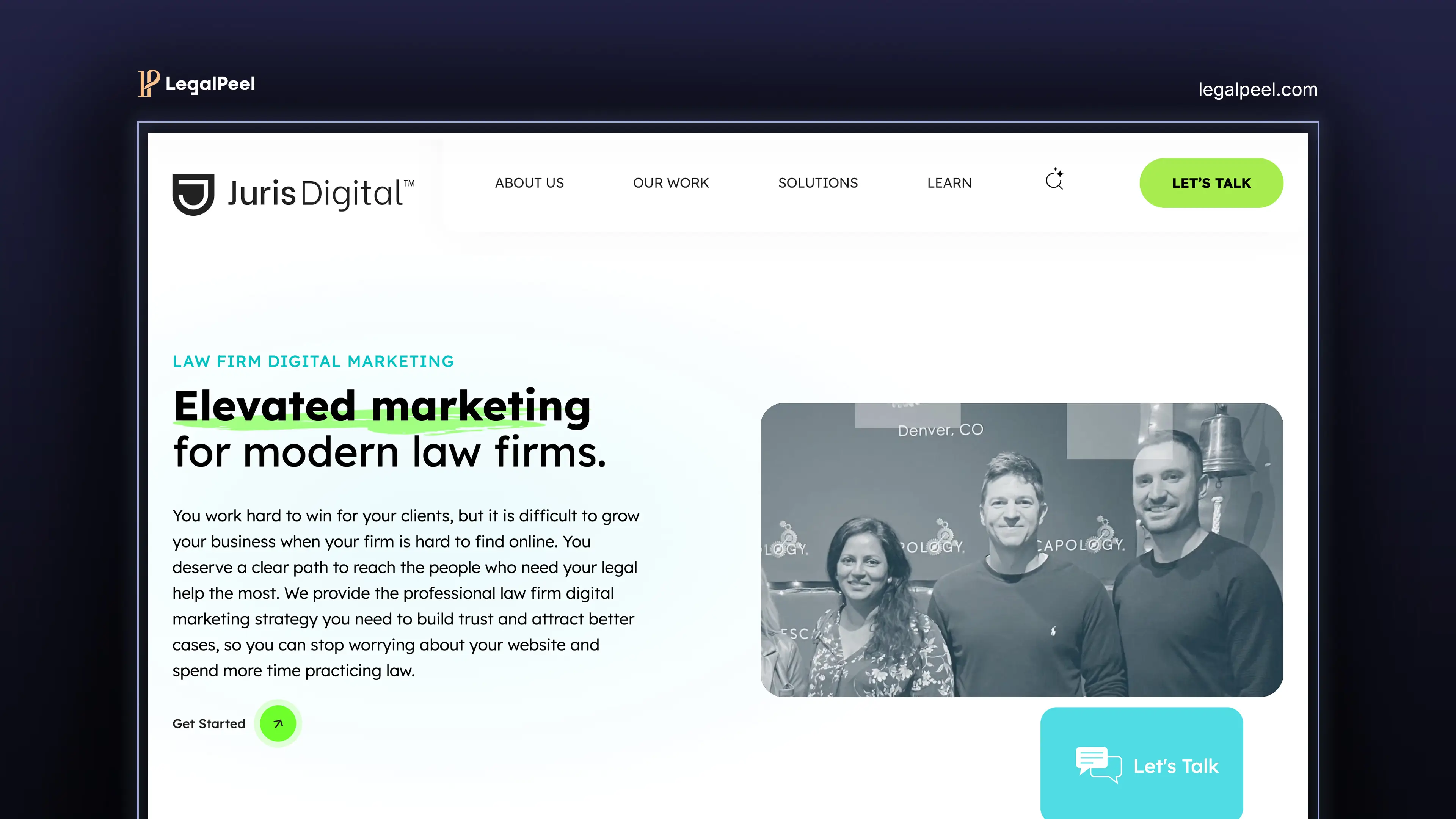
Juris Digital offers a performance marketing suite designed for growth:
- SEO (search engine optimization)
- PPC (paid ads management)
- Content marketing
- Analytics and reporting
Their services are geared toward firms that want measurable traffic growth and data-driven scaling.
LegalPeel Services
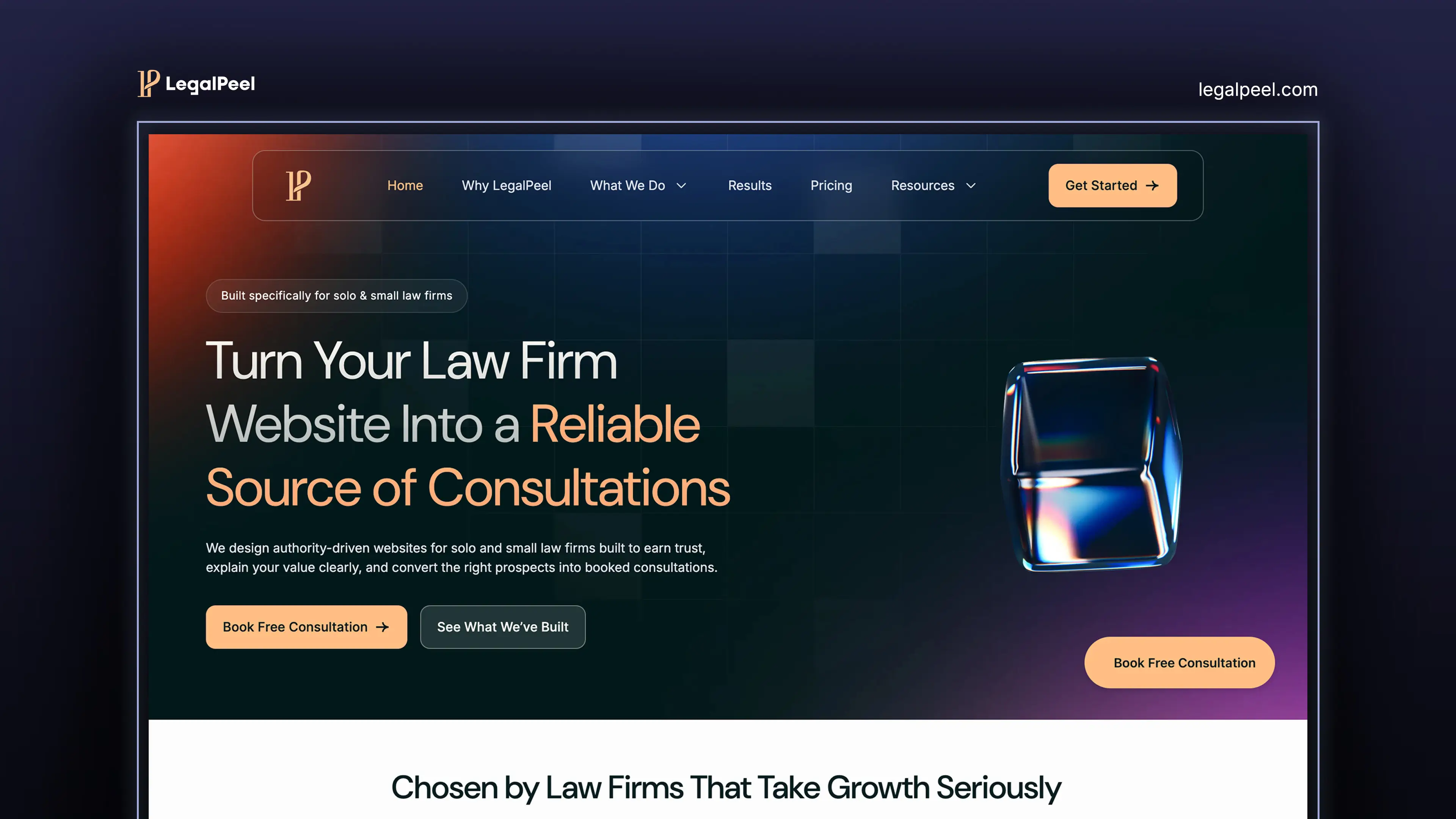
LegalPeel provides a more brand-centric and conversion-centric service stack:
- Branding (positioning, identity, messaging)
- Webflow website design & development
- SEO + AEO (Answer Engine Optimization)
- Funnel and conversion strategy
This combination is designed to help small and mid-sized firms build authority and convert visitors efficiently.
Target Audiences
Juris Digital primarily targets mid-sized to established law firms, while LegalPeel focuses on solo practitioners and small law firms.
Juris Digital serves firms that are ready to scale using an advanced legal digital marketing strategy.
In contrast, LegalPeel is built for smaller firms that need affordable legal marketing services to start generating leads quickly.
Website Design Strategy
Juris Digital typically builds SEO-driven websites, whereas LegalPeel combines SEO and UX conversion-focused law firm sites.
JurisDigital built WordPress websites for law firms, which are popular for SEO and scalable CMS.
But LegalPeel designed a Webflow website for a small law firm. As it has no code features allows faster launch, technical SEO advantages, and easy to edit CMS structure for busy lawyers.
Again, Webflow website has ADA compliant and more security features for a law firm. That's why LegalPeel serves modern law firms with Webflow CMS at an affordable budget.
Branding and Positioning
Juris Digital includes branding, but its main focus is performance marketing and lead generation.
On the other hand, LegalPeel puts strong emphasis on branding, positioning, and identity.
This helps small law firms stand out in a competitive market and build trust with potential clients.
SEO and Content Marketing
Juris Digital focuses on scaling traffic and leads through SEO and paid ads. And, LegalPeel focuses on organic SEO and legal content marketing for generating legal leads.
LegalPeel focuses on attracting qualified leads through a structure and intent-driven strategy. This includes:
- Local SEO for geographic targeting
- AEO for AI and voice search visibility
- Strategic content that aligns with client intent
Well, Juris Digital has a strong portfolio of content marketing for lawyers, and it's their winning service.
Conversion Optimization Strategy
Juris Digital mainly focuses on driving traffic first and then optimizing conversions later. Their approach is more growth-focused and data-driven.
In contrast, LegalPeel builds conversion-focused websites from the beginning.
This includes clear CTAs, structured layout, user flow, and lead capture systems.
That’s why LegalPeel focuses more on turning visitors into clients, not just increasing traffic.
Pricing and Cost Comparison
Juris Digital typically requires a higher upfront investment and affordable legal marketing pricing for small firms.
As an example, LegalPeel's custom website design costs around $2,500– $6,000. Whereas JurisDigital charges around $8,000– $15,000.
Juris digital monthly SEO services cost $5,000-$50,000, which is suitable for mid-size to established firms. LegalPeel's law firm SEO, Lead generation and funnel optimization services cost $1,750–$4,500 monthly.
Juris Digital pricing is suitable for firms looking for large-scale growth and long-term SEO dominance. Whereas LegalPeel is ideal for firms looking for cost-effective law firm lead generation agency services with faster ROI.
[[inner-cta]]
Which Agency Is Better for Your Law Firm?
Choose Juris Digital If:
Juris Digital is the right choice if your law firm is in a scaling stage and ready for aggressive growth.
- You have a high marketing budget to invest in long-term growth
- You need aggressive traffic growth through law firm SEO + PPC campaigns
- You want to dominate Google rankings for law firms in competitive markets
- You are focused on high lead volume and market expansion
That’s why Juris Digital works best for firms looking for a full-scale legal marketing agency for growth and visibility.
Choose LegalPeel If:
LegalPeel is ideal if you are a solo lawyer or small law firm looking for affordable and effective lead generation.
- You need a law firm website + branding + SEO in one solution
- You want better conversions, not just traffic
- You are looking for qualified legal leads through conversion optimization and funnel strategy.
- You prefer a cost-effective legal marketing agency with faster ROI
That’s why LegalPeel is best for firms that want a strong foundation with consistent lead generation.
Final Verdict
There’s no universal winner here, and that’s exactly the point. The right choice depends on your law firm’s stage, budget, and growth goals.
If you’re running a mid-sized or scaling firm with a larger budget and need aggressive, data-driven SEO campaigns, Juris Digital is built for that level of growth.
Whether you are just starting as a solo practitioner, don't have maintenance and monthly expenses to bear, you should go with a budgeted law firm web design with SEO packages like LegalPeel.
Want to consult and have a transparent web design project brief? Connect with LegalPeel today
[[last-cta]]
