
Best Solo Lawyer Websites: Inspire Your Practice In 2026
Summarize with AI





Key Takeaways
- Best solo lawyer websites have 2–5 pages max
- Personal branding beats firm branding for solo attorneys every time
- Hero section must answer: who you are, what you do, who you help
- One clear CTA repeated 3 times converts more than multiple different CTAs
- Webflow builds the fastest solo attorney websites for SEO and lead generation
Building a solo lawyer website often feels more complicated than it should be.
You need a site that works for one attorney, not a 50-lawyer firm. And most design inspiration online shows you big firm websites with 30 pages, multiple attorney profiles, and marketing budgets you don't have.
So, here are the best solo lawyer websites worth studying with real design breakdowns you can apply to your own practice.
What the Best Solo Lawyer Websites Actually Look Like
A solo law firm website should include essential pages and features without being overly complex. Well, auditing 150+ best solo practitioner attorney websites in the USA, they share four things in common:
2–5-page structure — Solo practitioner website has mainly 4 or 5 pages, like Homepage, About Attorney, Contact Page, Testimonials, or FAQs.
Strong branding — Integrate branding color and consistency across all pages, CTA's, and use a professional headshot in the hero section.
Immediate trust signals — Clear positioning with a micro niche like an Estate planning Attorney in Chicago, and highlight experience, certification and client testimonials.
Mobile-first experience — Most legal visitors come from mobile devices. The best solo lawyer websites load fast, keep forms short, and make the phone number visible immediately.
Well, most solo attorneys overthink this. Your referral contacts are already sold on you. Your website just needs to not lose them.
Bonus: Not sure what pages your solo law practice website actually needs? Read our guide on small law firm website design, which covers essential pages, CMS options, and what to skip.
7 Best Solo Lawyer Website Examples
Here are the top picks for the best solo law firm websites in 2026. Each one shows a different approach to personal branding, page structure, and conversion design.
1. Carpenter Lourie
%20(1).webp)
Carpenter Lourie is a solo practitioner attorney website that gets branding right from the first scroll.
Their hero section immediately leads with a clear positioning statement about the law's needs. She provides legal help for real estate and business law.
Clean navigation with 7 links keeps focus on a clear practice area. But this 7-category isn’t essential for a solo lawyer to immediately start a law firm website. As law firm website design costs increase for several pages.
The site's brand colors and typography are consistent across every page — a detail that separates professional solo attorney websites from DIY templates.
2. Goldberg Law
%20(1).webp)
Goldberg Law is a strong example of a solo law practice website that builds trust without a complicated design.
Their homepage answers all three questions above the fold: who this attorney is, what area of law they practice, and exactly who they help.
A single free consultation button appears in the navigation bar and again mid-page, making it impossible to miss, regardless of how far a visitor scrolls.
The attorney's headshot is professional, warm, and positioned next to a direct credibility statement. That combination reduces bounce rate faster than any design element.
Again, no unnecessary animations or multi-column layouts. Just clean typography, clear hierarchy, and a site that loads in under two seconds.
Read more: How to choose the best law firm builder and hosting provider for your budget.
3. BK Schott Law
%20(1).webp)
Ben Schott's attorney profile page is one of the best solo lawyer website examples for personal branding done well.
Well, most solo attorneys write their about page like a CV. Ben Schott writes his like a conversation. That tone difference is what makes a referred client feel confident enough to pick up the phone.
Here, the solo law firm website's vCard download option makes it easy for mobile visitors to save contact information directly.
Clear bar admissions, practice area focus, and direct contact options make this solo law firm website an example you can learn from, regardless of your practice area.
4. Sutton & Smyth, LLP
.webp)
Sutton and Smyth LLP is a great example of two solo practitioner attorney websites. The web design starts with two professional pictures of Sutton and Smyth smiling faces that instantly create authority.
The navigation stays intentionally simple with only six primary pages. That structure improves usability and keeps potential clients focused instead of overwhelmed.
Typography, spacing, and visual hierarchy are also handled consistently throughout the site.
Learn how to design a trust-building solo lawyer website without extra budget.
5. StoneMyers Law
.webp)
Stonemayerslaw is another good example of a law firm website, designed to convert legal leads easily.
This firm positions itself as a differentiator with bold branding and copy placement. A very simple yet conversion-friendly UX design brings clients a clear decision navigation.
Early consultation can really happen due to clear CTA placement on the homepage. Again, Melissa exactly targets Texas leads and clearly defines how she will help.
6. Austin Accident Lawyer
.jpg)
Austin Accident Lawyer is a strong example of a high-intent personal injury law firm website built for immediate lead capture. The hero section is direct, with a clear injury-focused value propostion .
The design prioritizes urgency and action, using prominent CTA buttons. This reduces friction and pushes users toward contact without distraction.
Visually, the site leans on trust-building elements such as case results, attorney credibility cues, and client-focused messaging. The layout is structured in a way that guides users from problem → trust → action very quickly, which is ideal for accident law leads.
7. Mary Jones Austin Collaborative Divorce & Mediation Attorney
.jpg)
Mary Jones Family Law is a good example of a solo practitioner family law website that focuses heavily on clarity, emotional positioning, and trust. The design uses a calm, professional aesthetic that aligns with sensitive legal services like divorce and custody.
The homepage structure is simple but intentional—clearly defining practice areas, attorney introduction, and consultation access without overwhelming the visitor. This helps users quickly understand what type of legal help is offered and whether it matches their situation.
CTA placement is consistent but not aggressive, which fits the emotional nature of family law clients. The site builds trust through personal branding, approachable imagery, and straightforward messaging that supports decision-making rather than pressure.
Solo Law Website Structures That Convert Best
2–3 Page Model
Best for attorneys who get most clients through referrals and just need a credibility anchor online.
- Home — who you are, what you do, one CTA
- About — personal story, credentials, bar admissions
- Contact — phone, form, map, office hours
That's it. Three pages, zero confusion, instant trust.
4–5 Page Model
Best for solo attorneys who want both referral credibility and local SEO rankings.
- Home
- About Attorney
- Practice Area
- Results
- Contact
The difference between 3 pages and 5 pages isn't complexity — it's local SEO. Each practice area page targets a different keyword cluster. A family law attorney with separate pages for divorce, custody, and child support captures three times the search traffic of a generic "family law" page.
Bonus: Check how to build a solo law firm website that converts
Final Takeaway
The best solo lawyer websites are simple, not complex.
Your advantage as a solo attorney is not budget or volume — it's personal connection. A potential client chose to search for an individual attorney, not a firm. Your website's job is to make them feel like they've already met you before they dial.
So, design is not an advantage.
At LegalPeel, we've built solo attorney websites that improve local visibility from the first 60 days. If you want a Webflow-built solo law firm website with personal branding, AEO structure, and a consultation funnel built in from day one, reach out to LegalPeel today.
FAQs About Best Solo Lawyer Websites
Have a project in mind?
Got a Project to discuss?
Explore Related Journals
.webp)
When choosing a law firm web design agency, evaluate experience with law firms, legal SEO optimization, lead generation and accessibility setup, fair pricing, and detailed milestones with a timeline breakdown.
So, you don't have to research a thousand times to choose the right one. Use this as a checklist and choose a web design partner without confusion or frustration.
7 Things to Look for in a US-Based Law Firm Web Design Agency
1. Experience With Law Firms
Hiring a general design agency vs a law firm web design agency makes a huge difference.
Designing a law firm site needs a completely different angle, like highlighting lawyers' credibility, maintaining accessibility and compliance, appointment form integration, case management software, and so on.
So, asking for previous work with a is an essential step before hiring.
2. Works with your firm size and practice area
You’ll never believe it, but yeah, you should do the hard work here. Before you move on to the next agency, make sure to take a look if they work with small or solo law firms like you.
Most solo and small firms make massive mistakes with it. Partnering with a reputable firm that works for mid-to-large law firms and has a top-tier pricing range. Meanwhile, you as a solo attorney get high pricing quotes or complex website-building features that you don't want to or to have.
Get inspiration with the best solo attorney website design examples.
3. Understanding of Legal SEO
So, you don't want to integrate SEO! As you have a referral network and you just want to build a simple website without investing much.
Wait! You need to think again! Launching your new law firm website with SEO isn’t a waste; it’s an investment that returns with great ROI.
So, get what you need to have! Local SEO optimized practice area pages, GMB profile setup and basic technical SEO setup.
4. Conversion-Focused Web Design
Your website shouldn't just look pretty to visit and take over and over. Law firm website design strategy should work on getting clients—a clear statement.
So, check out the attorney web design agency's portfolio to see how they work on website conversion. Like, how they design and place call-to-action buttons and contact forms, and where they locate credentials like awards and reviews so clients can trust easily and just tap a call to you.
5. Website Platform and Ownership
You have already researched the best website builder for a law firm, but does your website design company work with that? Big question here.
So, yeah! You can choose either WordPress, Webflow, Squarespace, or Wix…. It's up to you, but for sure ask for a breakdown of all the domain, hosting, and setup costs and then ownership. No compromise on it.
At LegalPeel, we sign an NDA before any contract and document ownership in it.
Don’t know whether WordPress or Webflow is better? Read our guide on WordPress vs Webflow.
6. Compliance and Legal Website Requirements
Law firm websites have additional considerations that a general business website may not.
Ask the agency how they approach accessibility, ADA compliance, privacy and security setup, state bar requirements, etc.
Your attorney website design shouldn't have thousands of features. But still, it needs to follow legal compliance before it's launched.
The general website agency is lacking here most of the time. So, don't go for cheap quotes.
7. Pricing and What's Included
You're looking for full website design and SEO packages or just a design project?
Define your budget and what your agency is going to be quoted for. And ask what the cost will be. Like, law firm website design cost, development cost, hosting and SEO setup cost, and copywriting cost.
So, you shouldn't be surprised by the extra hidden costs from the agency.
Checking pricing and deliverables is a must-have step.
8. Communication and Project Timeline
Mismanagement can often lengthen the design project and deliveries.
Ask whether they use project management tools like Slack, ClickUp, or Jira for clear milestones, deliverables and open communication.
Again, ask about the milestone timeline properly so you can launch your sites without extra cost and time.
Questions to Ask Before Hiring a Law Firm Web Design Agency
How many law firms have you worked with?
The very first question to justify their experience with a law firm website.
Don't see their project work on the website. There may be many template-based works there. You should ask for the real client website live review link.
Do you provide legal SEO?
Another question to ensure the SEO setup criteria. Ask whether they know how to optimize local practice area pages and bring local traffic to your site.
Who owns the website?
The most important deal you need to do. Ask first whether they hand over all the website ownership or just make you into a vendor contract.
What is included in the quoted price?
Ask for a detailed pricing quote breakdown in a document. Otherwise, you will end up with high, surprising costs.
Do you provide ongoing maintenance?
Clearly ask if they run monthly maintenance for technical issues, technical SEO setup and bug fixes. It'll definitely help you calculate monthly investment.
Can you show relevant case studies?
Ask for the real number results case study from them. Not a good design always justifies it.
You should examine whether they make a conversion-focused website and bring clients in return. Or is it all just in vain?
[[inner-cta]]
How Much Does a Law Firm Web Design Agency Cost?
A law firm web design agency costs between $3,000 and $20,000 depending on your firm size, number of pages, functionality, complexity, website builder, hosting, and maintenance.
Your basic attorney website cost should be $2,500–$5,000. Additional setup, integration, and functionality can increase cost.
Well, a boutique law firm website design agency can quote between $3,000– $6,000 for a solo and small law firm website.
Again, an enterprise agency can cost anywhere between $10,000–$50,000 for legal website design and development.
Final Checklist Before Hiring
- Relevant legal portfolio
- SEO strategy
- Conversion-focused design
- Transparent pricing
- Clear timeline
- Website ownership
- Maintenance/support
- Accessibility and security
Conclusion
Choosing a law firm web design agency from hundreds of options is a big task. You have to investigate multiple things at a time.
But you can make it easy with making a list of how much you can bear, a similar website sample that you want to inspire, no of website pages, and any other criteria you want.
It'll make things better for you and the selected agency to work on the right track with the right cost.
Overall, deciding on an agency is your turn! If you don't have the energy to research more, you can have a short session with LegalPeel.
You may get better web design with SEO and lead generation in mind. Who knows? Let's build your dreamy site today.
[[last-cta]]
Project Snapshot
Dorsel Law partnered with LegalPeel to transform its website into a conversion-focused digital platform. By combining strategic web design, SEO, and lead generation, the project was designed to attract the right prospective clients and turn website visitors into consultations.
About Dorsel Law and Website Design Project
So, our client Chris Dorsel practiced for over 20 years as a solo personal injury attorney in South Carolina. He had already referred clients for decades. Now he came to us just to leverage the digital era.
Like, really, his referral gets dropped down, as 60% of our clients made this the primary reason why they need a fast-developed law firm website.
So, what Chris Dorsel's proposal for a simple attorney website includes:
- Legal website design with SEO optimization
- Local SEO+ practice area pages
- Basic lead generation setup
Check out the portfolio of the Dorsel law firm.
The Challenge
1. Already a big competitive market for PI firms in South Carolina
From the very first time we checked the client's competitors in the personal injury market in South Carolina, it felt overcrowded. So many reputable firms have high-authority ranking websites on Google and business directories.
2. Local SEO optimization seems hard
So, obviously, we check whether keyword difficulty is lower or not. Surprisingly, the keyword difficulty is moderate (40-60), and that's what is the ultimate challenge for SEO optimization of solo attorney websites.
3. Need to start from scratch with UX mapping and psychology
We need to understand the target audience, their search intent, concerns, and decision-making process before structuring the website. The UX needs to guide potential clients from finding the firm to trusting the attorney and taking action.
4. Need fast launch and clear deliverables
The website needs to launch quickly, so we need to prioritize the most important pages, UX elements, SEO foundations, and conversion points without overcomplicating the initial build.
The Strategy
1. Strategy & Positioning
Since the market is already competitive, we first need to build a USP (Unique Selling Point) and maintain UX psychology.
The biggest win was that most PI firms have outdated websites that are made with templates.
So, we focus on modern tech legal websites that are built for the legal profession, trust, and recognition, rather than template-based websites everywhere.
2. UX & Conversion Strategy
So, we need to map the entire user journey before designing the pages.
We need to understand what potential clients are looking for, what builds trust, and what information they need before contacting an attorney.
The website should guide users naturally from finding the firm to taking action.
3. SEO Strategy
Since the client is competing with established websites, SEO needs to be considered from the beginning rather than added after the website is launched.
We need to focus on realistic practice-area and location-based keywords. Then, we need to build the right on-page, internal linking, and technical SEO foundation.
4. Lead Generation
We need to strategically place consultation opportunities, contact forms, phone CTAs, and other conversion points throughout the user journey.
Without planning a conversion funnel and lead capture tactics, an attorney website can't perform what it needs to
What We Achieve
- We delivered an SEO-optimized law firm website without any technical issues.
- The client approved the website at first glance. No revision need
- Website builder and hosting; website ownership fully given to the client.
- Overall, Client Chris's kind words and satisfaction
Result
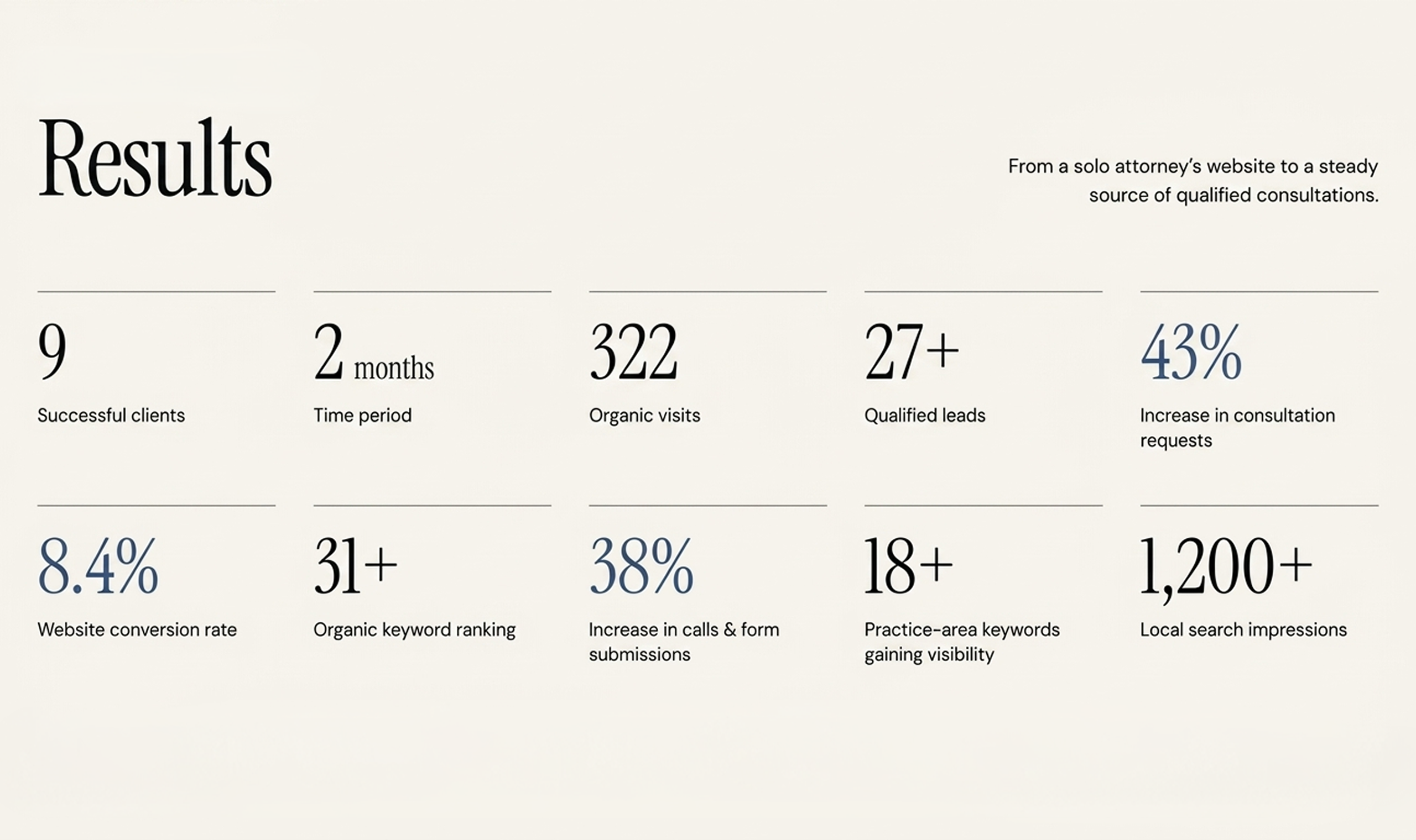
The result isn’t luck. It’s the outcome of an optimized, conversion-focused law firm website that’s working now and built to keep working.
See the numbers. And count yours.
Client Feedback
I was impressed with the thoroughness of the website and the copy that was created based on my answers to questions.
–Chris Dorsel, Founder, Dorsel Law
Would ChatGPT recommend your firm right now if someone asked?
Go test it. Ask ChatGPT, "Who's a good personal injury lawyer in [your city]?" Most solo and small PI firms get the same answer. A competitor's name they don't even think is better than them.
Here's the number that should worry you. 41.9% of consumers now say they'd use ChatGPT to research an attorney, up from just 9% in 2023. That's nearly 5x growth in three years. And 50.1% would use at least one AI answer engine—ChatGPT, Gemini, Claude, Perplexity, or Grok—somewhere in their search for a lawyer.
So this isn't a future problem. It's already happening in your market this week to someone searching for exactly the kind of case you handle.
Let's get into what's actually going on, why it can feel unfair if you've been in practice for years, and what actually moves the needle.
How Does ChatGPT Choose Which Personal Injury Lawyers to Recommend?
ChatGPT recommends and cites the PI lawyers' websites mainly in two ways:
First, training data: what ChatGPT already knows about your firm from what's been written about you online, up to its last update.
Second, live web search. When ChatGPT actually searches the web for a current answer, it's pulling primarily from Bing's index.
That means Google and Bing, both search engines, need to pay attention to ranking on ChatGPT and AI.
One analysis of ChatGPT's live citations found 87% matched Bing's top organic results for the same query.
So if your PI firm ranks well on Google but has never touched Bing Webmaster Tools, that gap is probably part of why you're invisible in AI.
Beyond the index, ChatGPT is also weighing what looks trustworthy.
Real attorney bios. Specific practice area pages. Reviews that read as if an actual client wrote them. Directory listings that match across Avvo, Justia, and Martindale.
This is the same E-E-A-T signal set Google's leaned on for years, just applied by a different kind of engine now.
Can ChatGPT Actually Recommend a Personal Injury Lawyer?
Yes. And people are already asking ChatGPT when they urgently need to call a PI lawyer.
One Reddit thread put it plainly. Someone needed a family law attorney, skipped Google entirely, and asked ChatGPT instead. Got three names back with full contact details, experiences, and website links for each.
So, legal leads are smarter nowadays. They pick up the phone, go to ChatGPT, and type, “I’ve had a car accident in Atlanta. Please give me the best PI lawyers who have specialized in car accidents near me.”
And ChatGPT cited the website of the PI firm that has listed car accidents in Atlanta and those plus experiences on their website, directory, and social media presence. If your website is missing that strategy, you're losing potential clients. So, go back to your site and note what needs to be improved for AI visibility.
Why My Established PI Firms Are Losing to Newer Firms in AI Search
You may wonder why your 15-year-established PI firm is not showing in AI, but a new solo law firm website gets cited! How?
This is the one that stings the most. And it shows up constantly online.
One managing partner at a firm with 30 years in litigation described checking ChatGPT himself after a client mentioned she'd searched there first and hadn't found his firm.
Solo law firms only three or four years into practice showed up ahead of him instead.
Here's the reason behind it:
AI can't read your track record
No matter how experienced your firm is in similar practice areas, until your website, social media, and directory listing structured data are pulling data to AI, it can't make the advantages cited in AI.
A newer firm that's invested in those assets simply looks more credible to an AI than an established firm that hasn't touched its site in five years.
Your website UX structure is outdated
It's 2026, but your site still brings visitors into a 10-year-old design. Stock photos, cluttered navigation, buried practice areas, and outdated layouts make it harder for both users and AI systems to understand what your firm actually does.
Your experience may be impressive, but if visitors have to dig through your website to find your practice areas, case results, attorney credentials, or reviews, you're making that credibility harder to discover.
You don't have SEO and AI-optimized sites
The good part. That gap is more fixable for established firms than it looks. You already have the verdicts, the peer recognition, and the client history newer firms don't have yet. The work is translating that into a format AI can actually read. Structured practice area pages that answer specific questions. Third-party mentions and citations. Reviews that reflect your actual case work, not just a star rating.
None of that requires a full rebuild. It requires the content on your site to catch up to what your firm has already done.
Your firm's authority isn't being turned into digital proof
This is where established firms have a major advantage.
You already have the verdicts, settlements, peer recognition, attorney experience, client history, and years of casework that newer firms are still building.
The problem is that much of that authority may be sitting offline—or buried somewhere on your website.
Turn those credentials into useful, structured content: detailed case results, attorney bios, practice-area expertise, FAQs, awards, reviews, and third-party mentions. The goal isn't to make your firm look more experienced. It's to make the experience you already have easier for search engines and AI systems to understand.
AI visibility isn't about being the newest firm
A newer firm appearing in ChatGPT doesn't automatically mean it's better than yours.
It often means its digital presence is easier for AI systems to interpret.
That gap is more fixable for established firms than it looks. You already have the hard part: years of real legal experience and results.
Now your law firm website needs to communicate that authority as clearly online as your firm demonstrates it offline.
[[inner-cta]]
Why ChatGPT, Claude, and Google AI Mode Recommend Different Firms
Here's a number that changes how you should think about this entire problem.
One study ran 3,200 "recommend a lawyer" prompts across ChatGPT, Claude, and Google AI Mode in the top 100 US cities. On 83% of those prompts, the three platforms had zero law firms in common.
Each platform also leans on a different directory almost entirely. Claude cited Avvo in 87.1% of its answers and Martindale in 55.5%. Google AI Mode barely touched either one but pulled Super Lawyers into 62.8% of its answers instead. Reddit and Yelp showed up regularly in Google AI Mode and never once in the chat assistants.
Practice area matters here too. Corporate law hit a 45.2% three-way agreement across platforms. Estate planning hit 0%. Across 100 cities, the three platforms never once converged on a shared firm for that practice area.What this means for a personal injury AI strategy. You can't optimize for ChatGPT alone and call it AI search visibility. Getting recommended in one engine says almost nothing about whether you'll get recommended in another. Your directory presence has to be broad, not concentrated wherever you happened to check first.
Read out the full version of this as a 15-point law firm AEO checklist if you want the complete breakdown.
How Can Personal Injury Law Firms Improve AI Search Visibility?
Here are the signals that can make your firm easier for AI search systems to understand:
Structured Practice Area Pages
Create dedicated pages for car accidents, truck accidents, slip and falls, wrongful death, and other PI services. Each page should answer the specific questions a potential client in that situation would actually ask.
Don't just list the service. Explain who the service is for, what the client should know, what steps they can take, and how your firm helps.
This makes your law firm website easier for Google, Bing, and AI systems to understand and connect with relevant searches.
Direct Answers in the Hero Section
The first few sentences on your page should quickly tell visitors and AI who you serve and why they should consider your firm.
Instead of:
"Welcome to our award-winning law firm, where clients always come first."
Say something more specific:
"We help injured people in Atlanta pursue compensation after car accidents, truck crashes, and serious personal injuries."
Don't bury the answer under fluff. Keep it direct, natural, and easy to understand so AI can extract the key information when someone asks a related legal question.
Consistent Directory Listings
Your firm's information shouldn't look different everywhere online.
Maintain consistent NAP (name, address, and phone number) information across platforms such as Avvo, Justia, Martindale-Hubbell, and Super Lawyers.
These third-party profiles can reinforce your firm's identity, location, practice areas, and authority across the web. When those signals are consistent, search engines and AI systems have an easier time connecting them to the same law firm.
Reviews AI Can Actually Parse
Many personal injury attorneys collect reviews but don't think much about what those reviews actually say.
A review that simply says "Great lawyer!" provides less useful context than one that naturally describes the type of case the attorney handled and the client's experience.
Encourage genuine clients to leave honest reviews on relevant platforms such as Google, Avvo, or Yelp. Don't manufacture or manipulate reviews. Instead, make it easy for satisfied clients to share their real experience.
Those third-party mentions can add another layer of credibility to your firm's online presence.
A Live Presence in Bing
Don't ignore Bing when you're thinking about AI search.
Verify your website in Bing Webmaster Tools, submit your sitemap, and check that important pages are being crawled and indexed.
It takes relatively little effort, but it gives you another way to make your firm's content discoverable across Microsoft's search ecosystem and AI-powered experiences.
Clear Attorney Expertise Signals
AI needs more than a firm's name to understand why that firm should be relevant to a specific legal question.
Make your attorneys' experience easy to find. Include detailed attorney bios, years of practice, specific practice areas, bar admissions, professional memberships, awards, notable cases where appropriate, and links to credible third-party profiles.
If your firm has handled thousands of personal injury cases, don't make visitors hunt for that information. Put the evidence of your expertise where both people and search systems can find it.
Check Your Robots.txt File
Your robots.txt file tells search engines and AI crawlers which parts of your website they can access. If important AI crawlers such as ChatGPT-User, PerplexityBot, or ClaudeBot are blocked, those systems may have difficulty discovering or retrieving your firm's content. Before investing in AI SEO, check your robots.txt and make sure you aren't accidentally preventing relevant crawlers from accessing your important practice area, attorney, and informational pages.
Add Legal Service and Attorney Schema
Schema markup gives search engines structured information about your law firm and attorneys. Add a LegalService schema to relevant firm/service pages and an Attorney schema to attorney profile pages to clearly communicate details such as your firm's name, location, practice areas, attorney names, credentials, and contact information. This doesn't guarantee that ChatGPT will cite your firm, but it can make your website's information easier for search systems to interpret and connect with relevant legal queries.
Content That Answers Real Client Questions
Your potential clients aren't searching only for "personal injury lawyer."
They're asking questions like
- "How long do I have to file a car accident claim?"
- "What should I do after a truck accident?"
- "Can I sue if the other driver was uninsured?"
- "How much is my injury claim worth?"
Build content that answers these questions clearly and accurately.
The goal isn't to write content simply because a keyword has search volume. Answer the questions your ideal clients are already asking.
When your website consistently demonstrates relevant expertise, it gives search engines and AI systems more context to understand when your firm is a useful answer.
We've written a deeper breakdown of the strategy behind this if you want to know how to rank your law firm in ChatGPT and AI search.
Final Words
So, would ChatGPT actually recommend your firm today?
If you're not sure, that's the honest starting point. Most solo and small PI firms haven't checked, and the ones that have are usually surprised by who's showing up instead of them.
None of this requires abandoning your reputation or your track record. It requires putting it somewhere AI can actually read it.
At LegalPeel, this is what our SEO and AEO services are built around for personal injury firms specifically. Audit first, fix the visibility gaps, then track what's actually working across every AI engine.
Get your free AI search audit.
[[last-cta]]

