Legal Marketing Funnels– How to Turn Visitors into Paying Clients
Implementing a successful legal marketing funnel is the ultimate goldmine to accelerate cases. But what about leveraging AI automation tools and call intake processes?

Summarize with AI


Key Takeaways
Frustrated with calculating the marketing budget, but it all feels like a scam? You will burn through cash without the right marketing maps.
And it's the legal marketing funnel you need!
This guide will walk you through the funnel stage examples, how to implement a full funnel strategy, and automation tools. Don’t miss the ROI calculator we provide at the end.
What are Legal Marketing Funnels?
Legal marketing funnel is a route map to collect legal leads to convert them into paying clients. This process involves obtaining the best clients, retaining them, and using automation tactics for long-term client acquisition.
Are Sales Funnels Really Effective for Law Firms?
Law firm sales funnels are effective within the strategic roadmap and leveraging AI automation tools. For mastering the legal practice growth for lawyers, integrating CRM and measuring ROI is a must!
Many lawyers still doubt that the law firm marketing funnel is effective. Sometimes, it is called snake oil marketing. Heard about it? Probably yes!
Implementing marketing funnels for law firms is beneficial when:
- Want to avoid wasting money on ineffective marketing
- Already have a referral network you want to expand.
- Operate a small firm with a limited marketing budget.
- Want to attract high-value clients without breaking the bank.
Well, are legal marketing funnels expensive? Within implementing all digital marketing strategies for lawyers in a scalable way—setting up multiple tools, lead generation tactics, content, and social media marketing. These are all included in a law firm funnel package, which is a bit costly.
But it's 10× more effective to capture leads to convert for a long time, which traditional marketing efforts and legal advertising strategies can't.
4 Stages of Law Firm Marketing Funnel: How do they work?
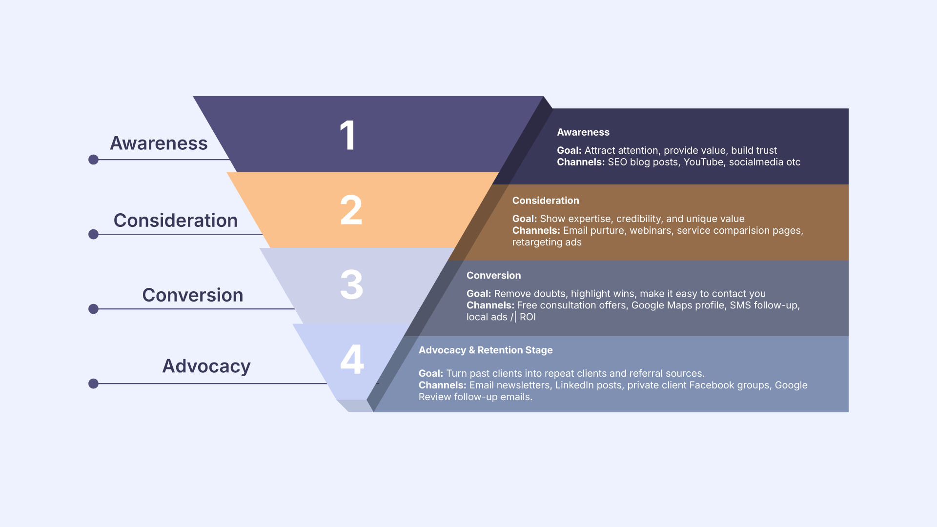
The different stages of a law firm marketing funnel are based on client journey behavior, their buying intent, and their purchasing decision.
1. Top Of the Funnel (ToFu): Awareness Stage
Clients are searching immediately for legal services or advice on search engines, forums, or from friends or family.
Examples:
An injured prospect in a car accident will search for queries like
“How long after a car accident can I claim injury?”
“Follow-up tasks after a car accident”
Winning Tips: These are common legal questions you need to answer with step-by-step guides and introduce your expertise in handling injury cases.
2. Middle Of the Funnel (MoFu): Consideration Stage
Prospects are now aware of legal needs, and they search or navigate law firms while keeping in mind which is best.
Examples:
At this stage, your legal client searches for similar queries, like
Personal injury lawyer near me, or How to choose the best law firm for personal injury.
Winning Tips: Show the expertise through testimonials, reviews vs content, and case studies.
3. Bottom of the Funnel (BoFu): Conversion Stage
Prospects here are ready to hire but need reassurance to take action through a single phone call, message, or free consultation.
Example:
Their searching queries like
–Personal injury attorney near me within 5 mi
–civil suit lawyers free consultation near me
Winning Tips: Add visible CTAs and contact info clearly with urgency and clarity. Don't forget to attach how you help similar cases.
4. Advocacy: Retention Stage
Turn past clients into repeat clients and referral sources.
Examples:
- Send personal thank-you messages or handwritten notes.
- Share legal updates that may impact them.
- Offer loyalty perks for returning clients or referrals.
- Ask for Google reviews and testimonials.
Winning Tips: Follow up strategically in time, make leaving reviews one-click easy, and showcase client success stories to inspire trust and keep your firm top-of-mind.
How to Implement Full-funnel Marketing Strategy: Step-by-step Guide
Keeping the lawyer funnel stage isn't enough! You need to set up automation tools to respond fast, track leads and convert them into potential client. See how to do it right:
Step 1: Drive a client journey mapping
Pick a single or 2-3 practice areas and a location. Search the audience, their personas, and common pain points and list out what they search for.
Segment each question into the funnel stage and solution. Now, make a content list based on the funnel stage.
Tips: Use Google, People Also Ask, Reddit and forums to understand your audience's behaviors.
Step 2: Design a conversion-friendly landing page
If you already have an attorney website, optimize the landing page with clear contact information, CTAs, testimonials, and FAQs.
Don't have one yet? Get a custom legal website optimization for SEO and conversion.
Step 3: Select marketing and automation tools
Before you jump into lead capturing, set the best tracking and AI intake tools for law firms.
Here are the best legal marketing automation tools:
Step 4. Start with law firm lead generation
Legal content marketing is the best way to capture leads, nurture them and convert.
According to the American Bar Association, 53% of law firms get client retention via legal blog content.
So, create ToFu content with proper SEO, AI and LLM optimization.
Use Paid Ads: Try Google LSA or Google Local Service Ads for lawyers—targeting your audiences, practice area and location.
Leverage social media for law firms: Must optimize and create educational content (posts or videos) on LinkedIn, Facebook, and YouTube.
Step 5. Nurture leads with MoFu content
Narrowing down audiences according to who sees ads through ClickFunnels, interacting with your websites, and social media posts.
It's time to engage them more with proven tactics, show results and build more trust.
Comparing blogpost: Write SEO optimized content to educate prospects on how your service offers the best value than others.
Case studies and testimonials: Show credentials by displaying clients' review testimonials on website pages. Also, share via social media and emails.
Provide templates and a checklist: Provide them value within premade templates, a legal documentation checklist to exchange information like email address.
Step 6. Convert leads with BoFu Content
Your leads are already convinced by your results and value. Now, convert them with a strong purchasing decision.
Strong CTAs: Place CTAs with an urgency, offer a limitation, or offer a free consultation.
Integrate contact forms: Keep your contact form fill-up criteria with only a single box. It'll encourage them to fill up without feeling negligent or overwhelmed.
Retarget Ads: Make sure to run another retargeting campaign that accelerates legal client acquisition.
Step 7. Retain and delight potential clients
After converting a lead into a client, the focus shifts to legal client retention and advocacy. Happy clients not only return for future needs but also refer new clients.
Client follow-ups: Send personalized check-ins after case milestones or legal updates relevant to their situation.
Loyalty programs and perks: Offer incentives for repeat clients or referrals (e.g., free consultations for family members).
Regular updates: Share newsletters, legal changes, or tips that affect them.
Request reviews and testimonials: Make it easy for potential clients to leave positive reviews on Google, Avvo, or social media.
Step 8. Analyze, Optimize, and Scale
Continuous improvement ensures your marketing remains effective and cost-efficient.
Track performance: Use analytics from Google Analytics, CRM, call tracking, and ad platforms to monitor conversions and ROI.
A/B test campaigns :Test landing pages, CTAs, ad creatives, and email marketing sequences to see what drives the highest engagement.
Refine content strategy: Update blog posts, videos, and guides based on search trends, audience behavior, and AI-driven insights.
Scale successful campaigns: Increase ad budgets, expand geographic targeting, or create new content topics that performed well.
[[inner-cta]]
How to Expect the Best ROI from Law Firm Marketing Funnel
Forget about all law firm marketing myths. Break down the ROI and optimize the legal funnel with estimated calculations and outcomes!
Here's the Quick ROI calculator you can use:
Formula: (New Clients × Avg. Case Value) − Marketing Spend = ROI
Example: 5 new clients per month × $3,000 avg. case = $15,000; Marketing spend = $2,000; ROI = $13,000 profit/month
Download a custom ROI calculator and keep earning cases, avoiding budget risks.
Final Words
Whether you are a solo practitioner or belong to an established law firm, you need to adapt trending attorney marketing strategies to evolving AI and automation tactics.
Otherwise, relying on traditional funnel marketing for law firms won't turn any leads!
Need help? Book a Free Consultation and get a custom funnel strategy mapping with estimated calculations.
[[last-cta]]
Frequently Asked Questions
Have a project in mind?
Got a Project to discuss?
Explore Related Journals
.jpg)
Choosing from the best law firm logos isn’t about finding something that looks legal. It’s about building instant credibility ,because most potential clients form a decision in seconds. The strongest attorney brands tend to rely on clear, scalable typography, trust-building color choices, and simple designs that work everywhere.
In this guide, we’ll break down the 13 best law firm logos and why they work, plus the essential elements behind effective attorney logo design and law firm logo design tips you can apply to your own firm.
Essential Elements of Successful Attorney Logo Design
Typography is the Real Logo
Most high-performing lawyer logos are not symbols. They are typography systems.
Because clients don’t remember icons. They remember names.
That’s why serif and structured sans-serif fonts dominate legal branding.
- Serif fonts = authority, tradition, trust
- Sans-serif fonts = modern, clean, approachable
- Custom fonts = premium differentiation
If your logo is unreadable, it is already failing.
Color Builds Instant Trust
Color theory is doing more work than most attorneys realize.
- Blue = trust and reliability
- Black = authority and strength
- Gold = prestige and high-value positioning
- Green = stability and long-term planning
Most successful law firms stick to one primary color.
Symbols Are Optional, Not Required
Many attorneys assume they need:
- Scales of justice
- Gavels
- Columns
- Shields
But the reality is different.
Modern law firm logos often avoid symbols completely. Why?
Because symbols reduce memorability when overused. A clean wordmark is often stronger than a generic legal icon.
Your logo must work everywhere
A logo for your law firm is not just for your website. It must work across:
- Mobile screens
- Business cards
- Court documents
- Social media profiles
- PDFs and documents
- Google Business Profile
- Email signatures
13 Law Firm Logos For Real Branding Inspiration
Most potential clients will never analyze your design choices. They will see your logo for a few seconds and decide whether your law firm website feels credible enough to contact.
Below are 13 real law firm websites and how their legal logos communicate authority in different ways.
1. Martin Pringle
Martin Pringle uses a traditional letterheads logo that reflects stability and long-standing credibility. The firm name is presented clearly with structured spacing, giving it a formal and professional presence. There is no visual distraction or symbolic design—just a clean wordmark that prioritizes trust and readability.
This type of branding works well for established firms because it reinforces authority without needing visual complexity. It feels dependable, which is exactly what legal clients look for.
2. Beall & Mitchell

Beall & Mitchell keeps the identity simple and approachable. The typography is balanced, evenly spaced, and easy to read in both digital and print formats. The logo avoids unnecessary styling, which makes it feel professional without being overwhelming.
This type of clean presentation helps smaller firms appear more credible and client-friendly, especially in competitive local markets.
3. Sheppard Mullin
.jpg)
Sheppard Mullin uses a refined wordmark approach that feels modern but controlled. The typography is structured and consistent, creating a sense of organization and legal authority. It avoids decorative elements and relies entirely on spacing and form.
This simplicity helps the brand maintain consistency across global legal markets while keeping the identity professional and scalable.
4. WilmerHale
.jpg)
WilmerHale’s logo is clean, balanced, and institutional. The typography feels stable and serious, reflecting the firm’s high-level legal positioning. The spacing and weight of the text create a strong visual hierarchy without relying on symbols.
This kind of identity communicates reliability, which is essential for corporate and litigation-focused legal work.
5. Mullen & Mullen
Mullen & Mullen uses repetition in its name as a branding strength. The logo is straightforward and highly legible, making it effective across advertising, local SEO, and legal directories. The typography is bold enough to stay memorable while still maintaining professionalism.
This approach is especially effective for personal injury law, where recognition and recall directly influence client inquiries.
6. Aldous Law
Aldous Law uses a minimal typographic identity that feels personal and direct. The logo does not rely on symbols or decorative elements. Instead, it builds trust through clarity and simplicity.
This style works well for boutique practices because it keeps the focus on the attorney’s name and reputation rather than visual branding tricks.
7. Montgomery Firm
.jpg)
The Montgomery Firm logo follows a structured wordmark style that emphasizes professionalism and clarity. The typography is clean and stable, making the brand feel reliable and accessible.
This type of identity works best for firms that want to balance approachability with legal authority, especially in client-focused practice areas.
8. NMJ Firm
NMJ Firm uses a monogram-style approach that simplifies the identity into initials. This creates a compact and recognizable brand mark that is easy to remember and apply across digital platforms.
Monogram logos like this are especially useful for smaller or growing firms trying to build strong recall without complex visual systems.
9. Atlanta Criminal Defense Team
.jpg)
This identity takes a descriptive branding approach rather than abstract design. The name itself acts as the logo, clearly communicating the firm’s practice area and location.
This strategy is powerful for local SEO and direct-response legal marketing because it prioritizes clarity over creativity, making it immediately understandable to potential clients.
10. THA Law Firm

THA Law Firm uses a simple and structured typographic identity that keeps the focus on readability and professionalism. The logo avoids unnecessary styling and instead relies on clear letterforms and spacing.
This minimal approach helps maintain consistency across website, print, and legal directories.
11. Meyring Law
.jpg)
Meyring Law uses a straightforward wordmark identity that emphasizes the firm name without additional visual complexity. The typography is clean and balanced, making it easy to recognize across platforms.
This kind of branding works especially well for firms that want to appear approachable while maintaining professional credibility.
12. MF Counsel
MF Counsel uses a compact typographic identity that feels modern and minimal. The initials create a strong brand shortcut, while the clean execution ensures readability.
This type of logo works well in digital-first legal marketing where simplicity improves recognition and recall.
13. G. Jacobs Law
.jpg)
G. Jacobs Law uses a personal name-based identity that strengthens trust through direct attribution. The typography is clean and professional, keeping the focus on the attorney’s name rather than decorative elements.
This approach works well for solo attorneys or boutique firms where personal reputation is the strongest marketing asset.
Common Types of Law Firm Logos
Wordmark Logos
A wordmark is your firm name set in a distinctive typeface , no symbol, no emblem.
Martin Pringle, Sheppard Mullin, and WilmerHale all use wordmarks. They work best when the firm name is short, memorable, and carries enough equity to stand alone.
Best for: established firms, solo attorneys using their own names, and boutique practices with strong personal brands.
Monogram Logos
A monogram uses 2–3 initials as the primary visual mark, often with the full firm name in smaller supporting type.
THA Law Firm and MendenFreiman both use this approach. Monograms solve the long-name problem and scale perfectly to favicon and social media profile sizes.
Best for: firms with long names, partnerships with hyphenated surnames, and practices targeting professional or corporate clients.
Emblem Logos
An emblem combines a symbol and text inside a unified shape like a badge or seal.
Atlanta Criminal Defense Team's shield mark is an example. Emblems communicate heritage and authority , but they lose legibility at small sizes if over-detailed.
Best for: litigation firms, defense practices, firms with 20+ years of history that want to signal institutional credibility.
Abstract Logos
Abstract marks use a geometric form that doesn't directly represent a legal concept.
They work best for IP law, tech-adjacent practices, and boutique firms targeting startup or corporate clients who associate abstract marks with innovation.
Best for: IP attorneys, startup counsel, tech-sector practices.
Combination Mark Logos
A combination mark pairs a symbol with a wordmark — either stacked vertically or arranged horizontally.
Mullen & Mullen's square mark is a strong example. Combination marks give you the most flexibility — use the full lockup for formal materials, the symbol alone for social profiles.
Best for: most small and solo law firms building a brand for the first time.
Law Firm Logo Checklist Before Launch
Website Compatibility
- Does the logo work on both white and dark backgrounds?
- Is there a horizontal version for the navigation header?
- Is the file delivered in SVG for infinite scalability?
Business Card Readability
- Is the firm name legible at 8pt font size?
- Does the logo work in black-and-white print?
- Is there a version without a tagline for compact layouts?
Social Media Visibility
- Does the icon-only version work at 400 × 400px (LinkedIn, Google Business Profile)?
- Is the logo legible at 32 × 32px (favicon)?
- Does it hold up as a circular crop ?
Signage Performance
- Does the logo work at a large scale—office door, lobby wall, vehicle wrap?
- Does it reproduce correctly in embroidery (no fine lines or gradients)?
Trademark Considerations
- Has the firm name and logo been searched against the USPTO trademark database?
- Is the logo sufficiently distinctive to qualify for trademark registration?
- Has the designer confirmed the typeface is licensed for commercial use?
Final Thoughts
A solo attorney doesn't need a custom crest or a heritage emblem. They need a wordmark that looks credible on a business card, loads fast in a website header, and tells a referred client they made the right call before they've read a word of your about page.
The firms on this list, from Martin Pringle's 75-year wordmark to Montgomery Law's solo attorney brand, all prove the same point. A law firm logo earns trust over time, across every surface it appears on, every time it looks the same.
At LegalPeel, every law firm website we build includes a full branding package — logo, colour palette, typography, brand guidelines, and all file formats.
All delivered before we build a single page. Want a law firm visual identity built for your solo or small firm practice? Reach out to LegalPeel today.
.jpg)
A call to action isn't just a button. It's the moment a stressed, uncertain visitor decides whether to reach out to you or close the tab and find someone else. Get it right, and your website becomes your best-performing associate. Get it wrong, and you're paying for traffic that never converts.
In this guide, you'll find seven proven calls to action built specifically for law firm websites — each designed to reduce friction, build trust, and turn visitors into consultation requests.
What Makes a Law Firm CTA Actually Convert?
Before you write a single word on your CTA button, you need to understand what's stopping your visitor from clicking.
Reducing Fear and Friction
Make a CTA that prompts leads to take the next step without feeling overwhelmed, pressured, or hesitant. Like: Book a free case consultation, Review my case, Talk to an experienced attorney.
Value Driven CTA's
Without hints of a benefit, a prospective clients wouldn't feel like clicking. Talk about what he would deserve or expect, like
- Protect Your Rights Before It’s Too Late
- Find Out What Your Case May Be Worth
- Get a Clear Legal Strategy for Your Situation
Using You Instead of We
Your CTA should create a conversation tone, like how they can benefit from you, not a generic what I can do tone!
Contact US for legal help, or talk to our attorneys
Examples:
- Get the Legal Support You Need Today
- Protect Your Future With Experienced Legal Guidance
- Talk to a Lawyer Who Understands Your Situation
Using Trust-Based Language
Trust-building CTA language helps reassure visitors that the process is confidential, professional, and client-focused. Words like “confidential,” “direct attorney access,” and “case evaluation” can increase consultation conversions.
- Your Consultation Is 100% Confidential
- Speak Directly With an Attorney
- Get Honest Answers About Your Legal Options
7 Proven Calls to Action for Law Firm Websites
Most law firm websites use the same tired CTAs and wonder why visitors leave. These seven are different and the results show it.
1. Free Consultation CTA — The Non-Negotiable
The free consultation CTA for lawyers is still the highest-converting CTA on any law firm website. But the copy matters more than the button color.
Weak version: Contact Us
Strong version:
- Get Your Free Consultation
- Practice area-specific CTAs
- Injured in an accident? Get a free case review today.
Using a word like "consultation" in the CTA may intimidate the average person. A direct phrase like "talk to a lawyer" often yields better conversions.
Most attorney websites use "Free Consultation" and stop there.
The attorneys who convert more add one of two things directly above the button: a risk-removal line. Here are the best call-to-action phrases for law firms that increase conversions.
- No fees unless we win
- Response within 2 hours
CTA + trust signal is what turns a click into a submitted form.
Where to place it:
- Hero section, above the fold
- End of every practice area page
- Sticky header on mobile
Bonus: Need help writing your hero section copy that leads into your CTA? See the best solo lawyer website examples, and you'll get it.
2. Click-to-Call CTA — The Mobile-First Essential
Adding a prominent click-to-call button in the mobile header is one of the highest-impact, lowest-cost CTA improvements a law firm can make.
Over 60% of legal searches happen on mobile. A potential client searching personal injury attorney near me at 9 pm wants to call, not fill out a form.
Copy formula:📞 book a consultation
Or for solo attorneys:Call [Attorney Name] Directly — (XXX) XXX-XXXX
Again, most attorney websites bury the phone number in the footer. A strong call-to-action belongs in the mobile header, permanently visible, on every single page.
Where to place it:
- Mobile sticky bar at the bottom of every page
- Top navigation bar (mobile)
- Hero section alongside the consultation button
3. Practice Area-Specific CTA — The Conversion Multiplier
A generic CTA on a specific practice area page is a missed opportunity.
Many people enter attorney websites through practice area pages rather than the homepage. A CTA on every page l ensures visitors always have a clear next step.
Personal injury CTA example:
Hurt in a car accident? Free case review, no fees unless we win.
Family law CTA example:
Going through a divorce in [City]? Book a confidential consultation today.
Criminal defense CTA example:
Charged with a crime? Talk to a criminal defense attorney now — available 24/7.
So, the formula is simple: name the problem + name the client + remove the risk.
That three-part structure is what makes compelling calls to action examples for specific practice areas versus generic law firm pages.
Where to place it:
- Bottom of each practice area page
- Mid-page after the practice area description
4. Intake Form CTA —Higher Conversion
The ideal form for scheduling a free case review should be: name, phone number, email, and a brief description of the case.
People feel uncomfortable if asked to provide too much personal information from the very beginning.
Most law firm contact forms ask 10+ questions. That kills attorney website lead generation before it starts.
High-converting form CTA copy: Tell Us About Your Case — Takes 60 seconds
Under the form headline, add three fields max:
- Full name
- Phone number
- What happened? (2–3 sentence text field)
That's it. Get the lead first. Collect details on the consultation call.
Weak form button copy: Submit / Send
Strong form button copy: Send My Free Case Review Request →
Where to place it:
- Contact page (primary)
- Homepage, mid-page or sidebar
- End of every blog article
5. Trust-Building CTA — For Research-Stage Visitors
Your law firm website wouldn't only confirm leads. Some are comparing attorneys, reading reviews, and deciding who to trust first.
Matching the tone of your CTA to the audience's intent helps build trust and encourages action without pushing too hard.
Incorporate softer prompts to engage visitors still in the information-gathering stage.
Trust-building CTA examples for lawyers
- Read What Our Clients Say →
- See Our Case Results →
- Download Our Free [Practice Area] Guide
These attorney website conversion tips work because they give the research-stage visitor a lower-commitment action. They stay on your site longer, build trust, and convert on a return visit.
Where to place it:
- About page — below attorney bio
- Homepage — between hero and practice areas
- Blog posts — mid-article
6. Urgency CTA — For Time-Sensitive Practice Areas
Personal injury, criminal defense, and immigration cases all have deadlines. Statute of limitations, arraignment dates, visa expiration. Your CTA should reflect that reality.
Personal injury urgency CTA:
Statute of limitations may apply to your case. Get a free review today before time runs out.
Criminal defense urgency CTA:
Charged? Don't wait. Every hour matters in a criminal case — call now.
Immigration urgency CTA:
Visa deadline approaching? Talk to an immigration attorney today.
Well, urgency CTAs feel manipulative if they're fake. But for practice areas where real deadlines exist, this is honest and necessary.
A personal injury client who waits 3 years loses their right to sue entirely. Your CTA should tell them that clearly.
Where to place it:
- Practice area pages for PI, criminal defense, immigration
- Homepage hero for practices with time-sensitive cases
7. Mobile Sticky CTA — The Silent Converter
A persistent click-to-call button in the mobile header visible without scrolling is one of the fastest wins for law firm website conversion optimization.
A mobile-friendly law firm CTA doesn't need to be complicated. Two taps, no scrolling, no searching. A mobile user at 11pm who just had an accident doesn't want to navigate. They want to call or send a message in under 10 seconds.
Where to place it:
- Bottom of every page — mobile only
- Stays visible as the user scrolls
Where to Place CTAs on a Law Firm Website
The best law firm homepage CTA best practices follow one rule: never make a visitor hunt for the next step.
Here's the minimum CTA placement strategy for any attorney website:
CTA Design Best Practices for Attorney Websites
Button Color and Contrast
Button text must achieve a minimum contrast ratio of 4.5:1 against its background to meet WCAG AA compliance. Use tools like WebAIM's Contrast Checker before finaliZing any CTA color palette.
Navy, deep charcoal, and rich burgundy read as authoritative — colors that legal audiences associate with competence and trustworthiness.
Avoid yellow-on-white or light-gray-on-white combinations that pass the eye test but fail accessibility audits.
Mobile Optimization
- Set minimum button height to 44–56px on mobile viewports
- Pin a sticky "Call Now" or "Free Consultation" bar at the bottom of mobile screens
- Use tel: links so tapping the CTA immediately opens the dialer
- Ensure form modals triggered by CTAs are scrollable and don't block the keyboard
- Test tap-zone accuracy on real devices, not just browser emulators
ADA Accessibility Considerations
- Add aria-label=Schedule a free consultation to icon-only or ambiguous buttons
- Ensure keyboard users can tab to and activate every CTA
- Provide visible: focus rings — never use outline: none without a custom replacement
- Avoid conveying urgency through color alone pair with text
- Test CTAs with NVDA, VoiceOver, or axe DevTools before launch
Form Length and Conversion Rate
Keep homepage or hero CTAs to 2–3 fields maximum
- Use conditional logic to show additional fields only after the first are completed
- Offer two paths: a short form for quick contact, and a longer intake for detailed consultation scheduling
- Mark optional fields clearly — never leave visitors guessing what's required
- Auto-format phone fields and disable the submit button until the minimum required fields are valid
How to Measure CTA Performance on Law Firm Websites
Conversion Rate Tracking
Track the percentage of visitors who complete a desired action, such as booking a consultation or submitting a form.
This helps identify which pages and CTAs generate the most leads.
Click-to-Call Tracking
Monitor how often visitors click your phone number or call button. This is especially valuable for practice areas where potential clients need immediate legal assistance.
Form Submission Analytics
Measure form submissions, completion rates, and abandonment rates to identify friction points and improve lead generation.
Heatmaps and User Behavior Tools
Use heatmaps and session recordings to see where users click, how far they scroll, and whether they engage with your CTAs.
A/B Testing CTA Copy
Test different CTA variations, such as "Schedule a Consultation" vs. "Speak With an Attorney Today," to determine which version drives more conversions.
Key Takeaway: Regularly tracking CTA performance helps law firms improve conversions, generate more qualified leads, and maximize website ROI
Final Words
Law firm website CTA should have one direction: convert. There's no huge rules about CTA placement. But, you should write the CTA in a way that feels urgent and reliable for the client.
So, does your website call to action for law firm conversion? If not, fix it soon. Or, reach out to us for a compelling CTA and A/B test now.
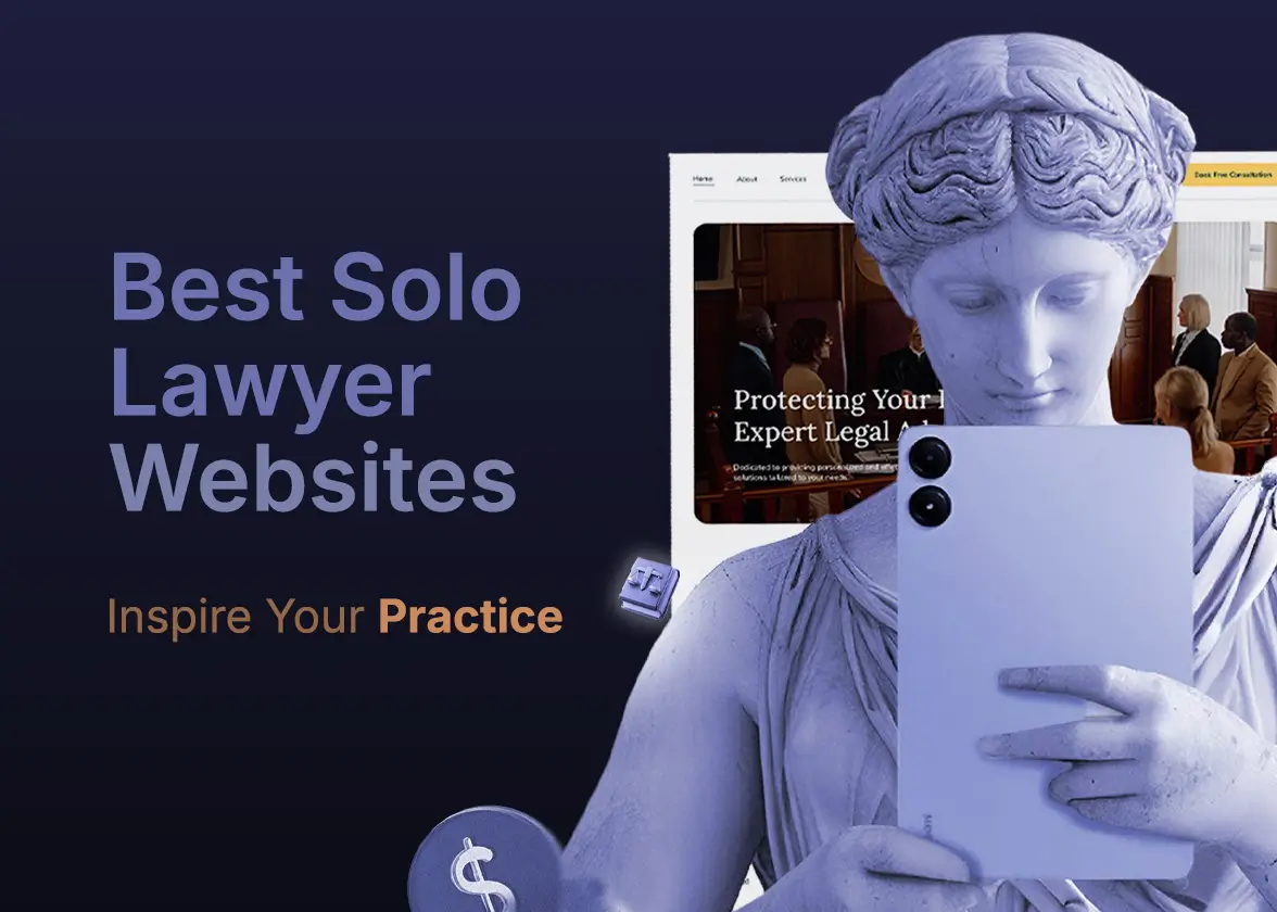
Building a solo lawyer website often feels more complicated than it should be.
You need a site that works for one attorney, not a 50-lawyer firm. And most design inspiration online shows you big firm websites with 30 pages, multiple attorney profiles, and marketing budgets you don't have.
So, here are the best solo lawyer websites worth studying with real design breakdowns you can apply to your own practice.
What the Best Solo Lawyer Websites Actually Look Like
A solo law firm website should include essential pages and features without being overly complex. Well, auditing 150+ best solo practitioner attorney websites in the USA, they share four things in common:
2–5-page structure — Solo practitioner website has mainly 4 or 5 pages, like Homepage, About Attorney, Contact Page, Testimonials, or FAQs.
Strong branding — Integrate branding color and consistency across all pages, CTA's, and use a professional headshot in the hero section.
Immediate trust signals — Clear positioning with a micro niche like an Estate planning Attorney in Chicago, and highlight experience, certification and client testimonials.
Mobile-first experience — Most legal visitors come from mobile devices. The best solo lawyer websites load fast, keep forms short, and make the phone number visible immediately.
Well, most solo attorneys overthink this. Your referral contacts are already sold on you. Your website just needs to not lose them.
Bonus: Not sure what pages your solo law practice website actually needs? Read our guide on small law firm website design, which covers essential pages, CMS options, and what to skip.
7 Best Solo Lawyer Website Examples
Here are the top picks for the best solo law firm websites in 2026. Each one shows a different approach to personal branding, page structure, and conversion design.
1. Carpenter Lourie
%20(1).webp)
Carpenter Lourie is a solo practitioner attorney website that gets branding right from the first scroll.
Their hero section immediately leads with a clear positioning statement about the law's needs. She provides legal help for real estate and business law.
Clean navigation with 7 links keeps focus on a clear practice area. But this 7-category isn’t essential for a solo lawyer to immediately start a law firm website. As law firm website design costs increase for several pages.
The site's brand colors and typography are consistent across every page — a detail that separates professional solo attorney websites from DIY templates.
2. Goldberg Law
%20(1).webp)
Goldberg Law is a strong example of a solo law practice website that builds trust without a complicated design.
Their homepage answers all three questions above the fold: who this attorney is, what area of law they practice, and exactly who they help.
A single free consultation button appears in the navigation bar and again mid-page, making it impossible to miss, regardless of how far a visitor scrolls.
The attorney's headshot is professional, warm, and positioned next to a direct credibility statement. That combination reduces bounce rate faster than any design element.
Again, no unnecessary animations or multi-column layouts. Just clean typography, clear hierarchy, and a site that loads in under two seconds.
Read more: How to choose the best law firm builder and hosting provider for your budget.
3. BK Schott Law
%20(1).webp)
Ben Schott's attorney profile page is one of the best solo lawyer website examples for personal branding done well.
Well, most solo attorneys write their about page like a CV. Ben Schott writes his like a conversation. That tone difference is what makes a referred client feel confident enough to pick up the phone.
Here, the solo law firm website's vCard download option makes it easy for mobile visitors to save contact information directly.
Clear bar admissions, practice area focus, and direct contact options make this solo law firm website an example you can learn from, regardless of your practice area.
4. Sutton & Smyth, LLP
.webp)
Sutton and Smyth LLP is a great example of two solo practitioner attorney websites. The web design starts with two professional pictures of Sutton and Smyth smiling faces that instantly create authority.
The navigation stays intentionally simple with only six primary pages. That structure improves usability and keeps potential clients focused instead of overwhelmed.
Typography, spacing, and visual hierarchy are also handled consistently throughout the site.
Learn how to design a trust-building solo lawyer website without extra budget.
5. StoneMyers Law
.webp)
Stonemayerslaw is another good example of a law firm website, designed to convert legal leads easily.
This firm positions itself as a differentiator with bold branding and copy placement. A very simple yet conversion-friendly UX design brings clients a clear decision navigation.
Early consultation can really happen due to clear CTA placement on the homepage. Again, Melissa exactly targets Texas leads and clearly defines how she will help.
6. Austin Accident Lawyer
.jpg)
Austin Accident Lawyer is a strong example of a high-intent personal injury law firm website built for immediate lead capture. The hero section is direct, with a clear injury-focused value propostion .
The design prioritizes urgency and action, using prominent CTA buttons. This reduces friction and pushes users toward contact without distraction.
Visually, the site leans on trust-building elements such as case results, attorney credibility cues, and client-focused messaging. The layout is structured in a way that guides users from problem → trust → action very quickly, which is ideal for accident law leads.
7. Mary Jones Austin Collaborative Divorce & Mediation Attorney
.jpg)
Mary Jones Family Law is a good example of a solo practitioner family law website that focuses heavily on clarity, emotional positioning, and trust. The design uses a calm, professional aesthetic that aligns with sensitive legal services like divorce and custody.
The homepage structure is simple but intentional—clearly defining practice areas, attorney introduction, and consultation access without overwhelming the visitor. This helps users quickly understand what type of legal help is offered and whether it matches their situation.
CTA placement is consistent but not aggressive, which fits the emotional nature of family law clients. The site builds trust through personal branding, approachable imagery, and straightforward messaging that supports decision-making rather than pressure.
Solo Law Website Structures That Convert Best
2–3 Page Model
Best for attorneys who get most clients through referrals and just need a credibility anchor online.
- Home — who you are, what you do, one CTA
- About — personal story, credentials, bar admissions
- Contact — phone, form, map, office hours
That's it. Three pages, zero confusion, instant trust.
4–5 Page Model
Best for solo attorneys who want both referral credibility and local SEO rankings.
- Home
- About Attorney
- Practice Area
- Results
- Contact
The difference between 3 pages and 5 pages isn't complexity — it's local SEO. Each practice area page targets a different keyword cluster. A family law attorney with separate pages for divorce, custody, and child support captures three times the search traffic of a generic "family law" page.
Bonus: Check how to build a solo law firm website that converts
Final Takeaway
The best solo lawyer websites are simple, not complex.
Your advantage as a solo attorney is not budget or volume — it's personal connection. A potential client chose to search for an individual attorney, not a firm. Your website's job is to make them feel like they've already met you before they dial.
So, design is not an advantage.
At LegalPeel, we've built solo attorney websites that improve local visibility from the first 60 days. If you want a Webflow-built solo law firm website with personal branding, AEO structure, and a consultation funnel built in from day one, reach out to LegalPeel today.
